Calzedonia

A style guide for Italy's favourite underwear brand

  • Branding

CLIENT

Calzedonia

OUTPUT

Branding Guidelines and Website Restyling

CREATIVE FIELDS

Strategy, Communication

We developed the new branding guidelines for Calzedonia, the Italian company that has offered innovative legwear and beachwear trends since 1986.

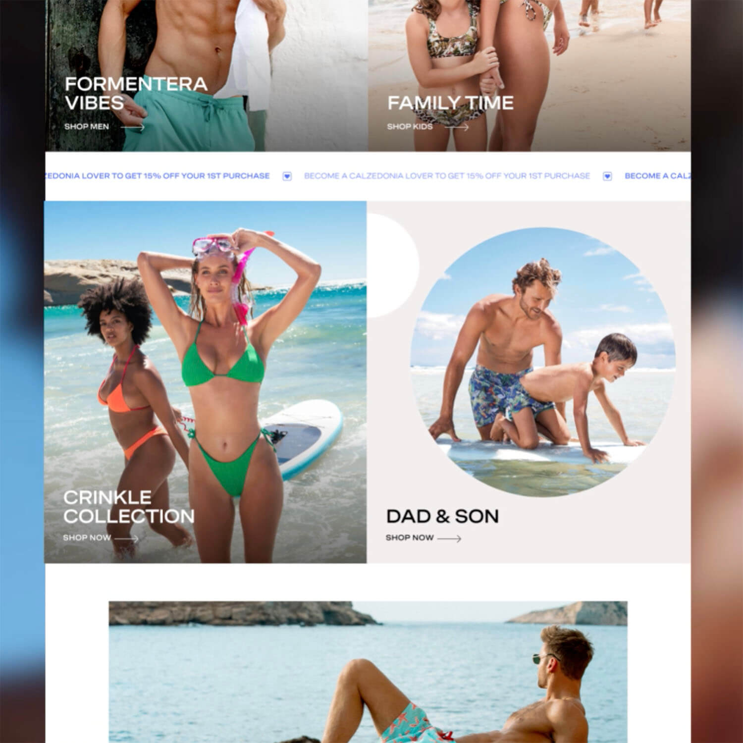
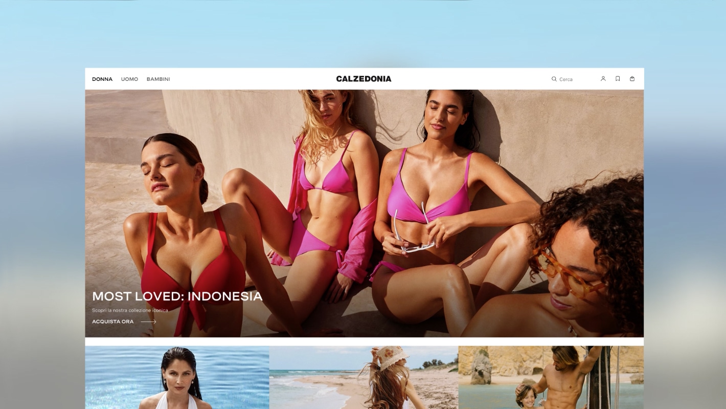
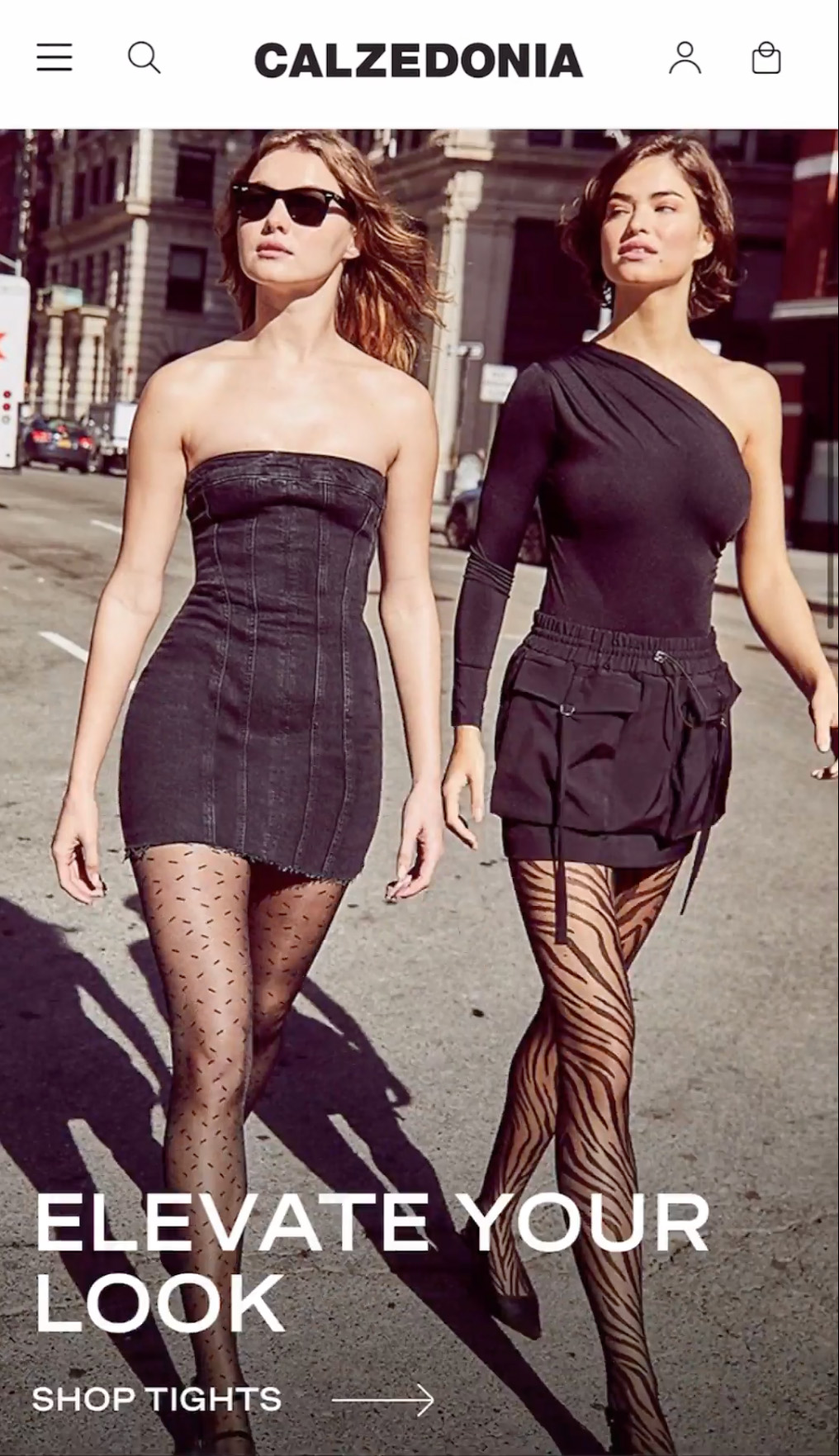
The new branding guidelines had to translate Calzedonia’s strong identity into an effective visual language across all touchpoints.
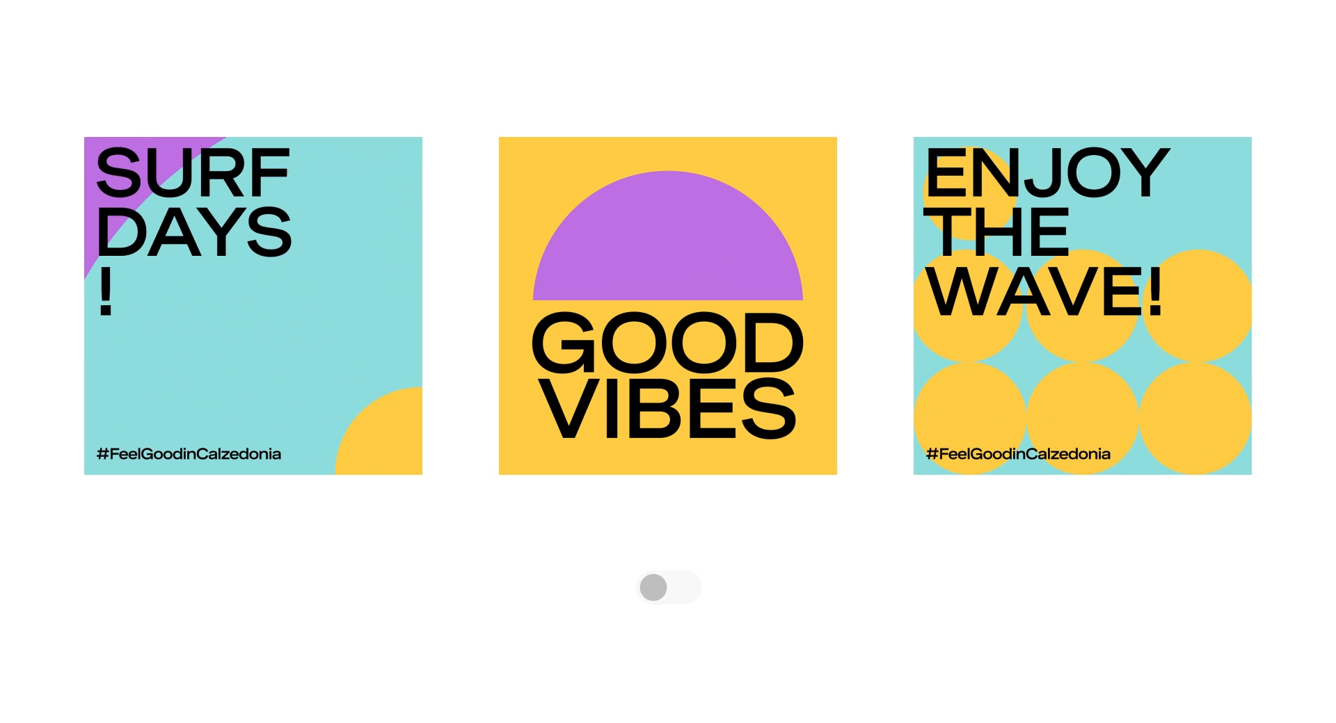
From workshops with the client, we identified three keywords that embody the brand values: pop, iconic and product driven.

“Pop” represents Calzedonia’s bright, joyful and playful attitude. “Iconic” refers to its timeless, confident and recognizable value. “Product-driven” embodies the nature of the brand’s offering and how its products are always up to date, innovative and on trend.

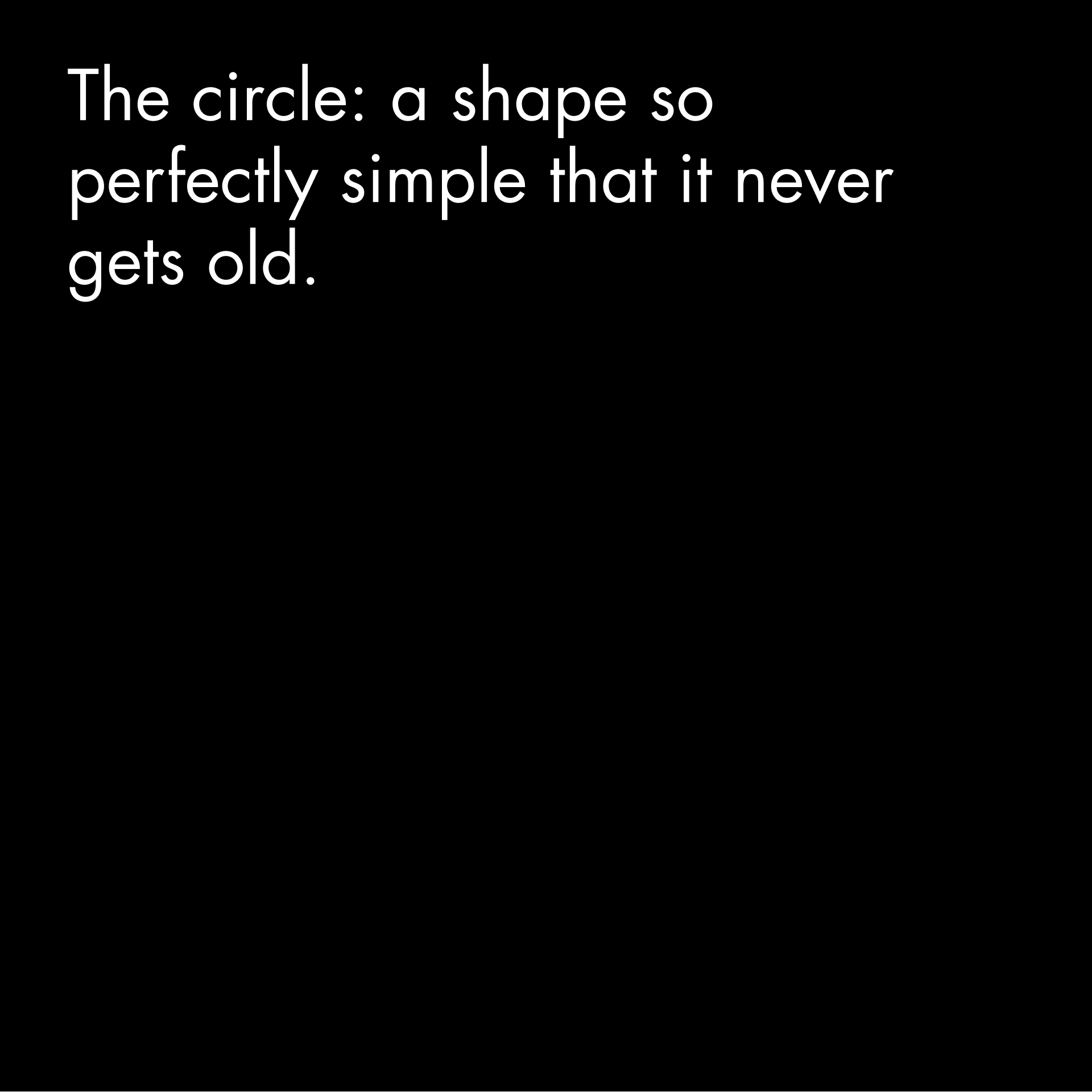
To create the guidelines, we took these concepts and interpreted them through three visual elements: font, shape and colour.

Font

We chose to use the Spezia font family for all purposes to ensure consistency across all touchpoints. This bold san serif font matches the pop aspect of the Calzedonia brand. It is also a variable font family with a wide range of weights that we used to create a typography hierarchy to make the texts easier to read.

Frank Studio

Shape

Finally, we identified the circle as the perfect shape to represent Calzedonia’s iconic standing. The shape can be used to create dynamic visuals with grids, patterns and blur or as a recognizable way of framing images.

Frank Studio
Frank Studio

Colour

The primary colours are the strong and timeless combination of black and white. The secondary colour palette consists in a range of impactful tones, each associated with a different part of the e-commerce to help guide the customer journey. Hot pink represents the sales, violet the loyalty program, bright green promotions.

Frank Studio

To reinforce the concept of a product-driven brand, we also defined a specific colour palette for the Spring-Summer and one for Autumn-Winter to go with the mood of the collections and the seasonal product selection.

Frank Studio

The website

We went on to redesign the entire website, combining the new visual identity and brand concept with an optimized user experience to make shopping easier and more gratifying for the customer.
We did this in a number of different ways, starting with the structure. We introduced a modular structure with dynamic modules that can be used across the site to offer the customer personalized information and product selections. We redesigned the main navigation so that users can access all areas for women, men and kids directly from the homepage. We highlighted the most requested customer services by incorporating eye-catching graphics into the dropdown menu on subjects such as the size guide, how promotions work and how to find the right product – all to increase customer satisfaction and minimize returns.

Frank Studio
Frank Studio

We also reinforced the brand identity with UI effects and animation. As Calzedonia is a product-driven brand we included elements that reflect the product itself whether it be a blur effect to recall the translucent quality of a low denier, or a stretchy sales strip to recall the key quality of a pair of tights. Together, all of these features create a high-impact, polished and seamless experience for Calzedonia and its online customers.

Frank Studio
Frank Studio
Frank Studio

View Also

Fornasetti - Creating a store for practical madness

Fornasetti

Creating a store for practical madness

Diesel - Breaking rules and banishing black

Diesel

Breaking rules and banishing black

Frank Studio is a Milan-based, digital at heart agency that offers integrated solutions and full e-commerce related services for fashion and design brands helping them grow their business & awareness. Discover our works