René Caovilla

An e-commerce for the quintessence of elegance

  • E-commerce UX & UI

client

René Caovilla

output

E-commerce website

creative fields

UX & UI, Interaction Design, Visual Identity, Art Direction

Designing an online boutique for the luxury jewellery shoe.

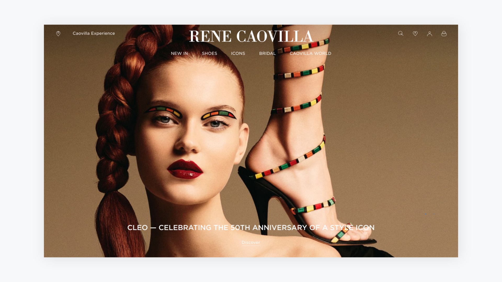
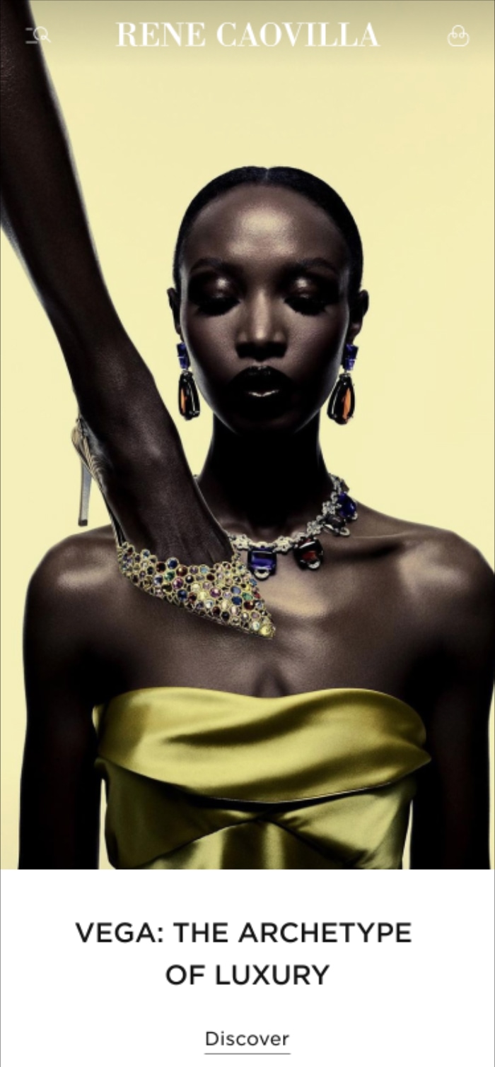
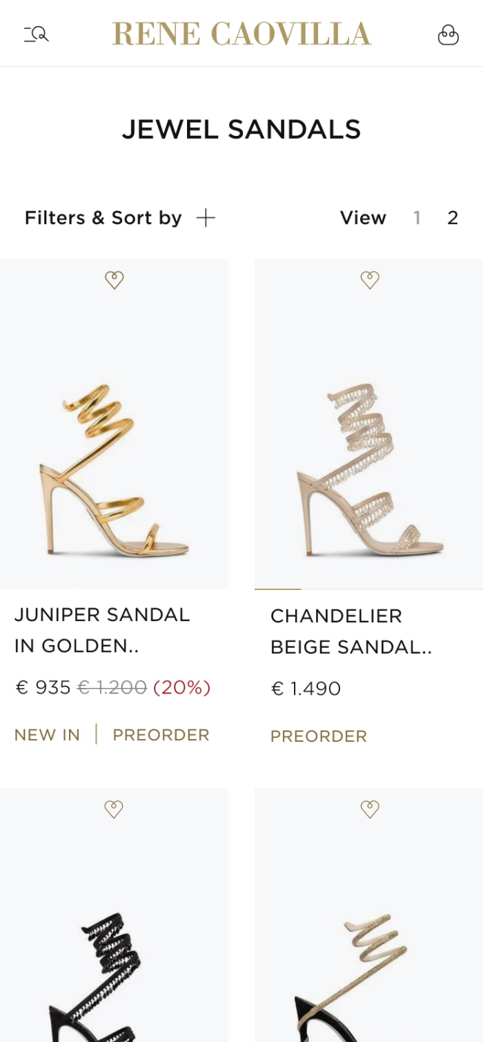
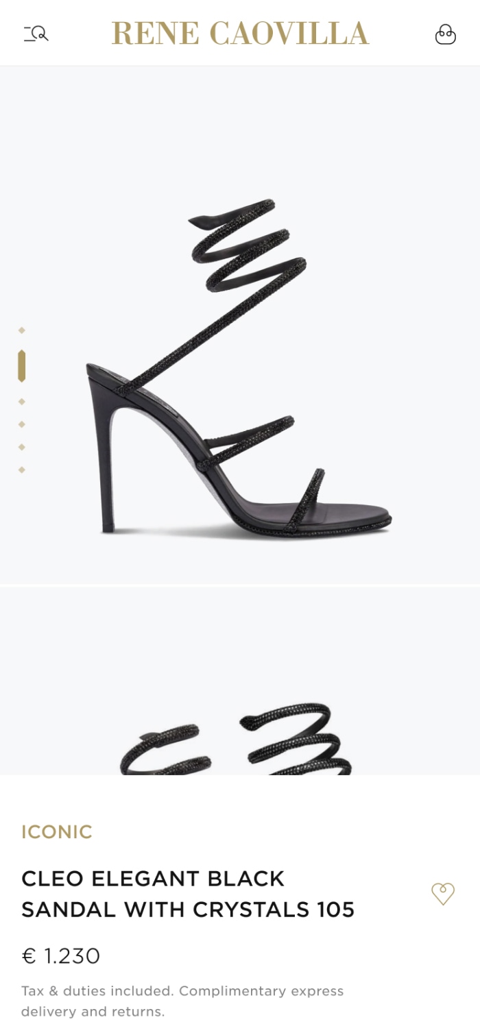
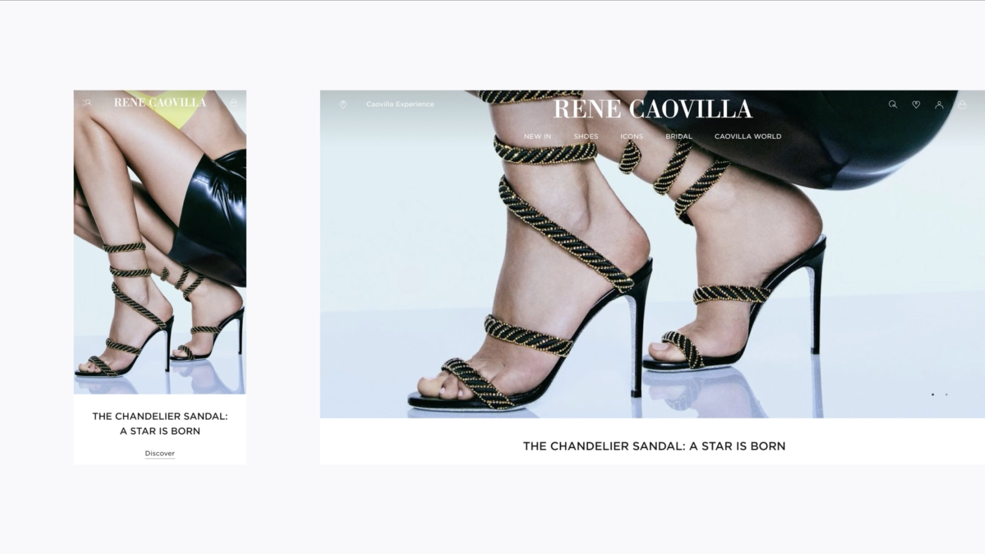
Since 1934 René Caovilla has epitomized the supreme essence of excellence, refinement and timeless elegance. The word quintessential sums this up perfectly and so became our guiding concept. It enabled us to highlight the qualities of the legendary Caovilla jewellery shoe while combining it with a harmonious and contemporary customer experience.

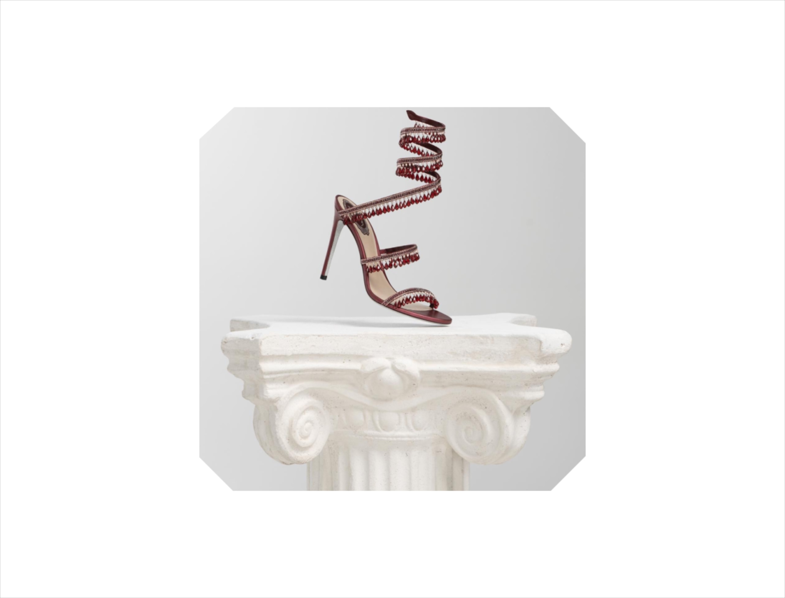
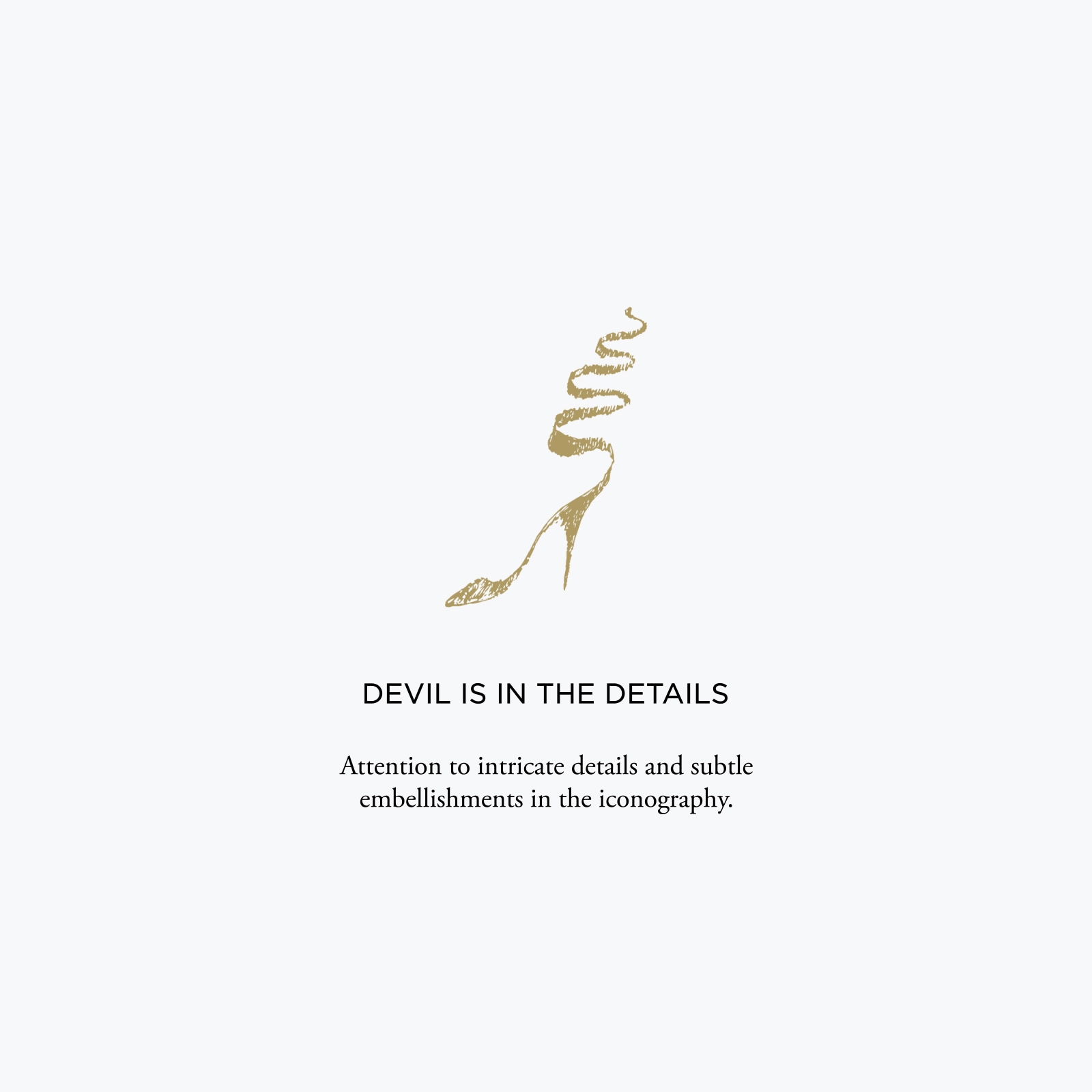
To explore the quintessential customer journey, we identified 3 key features of the brand’s product: preciousness, sinuousness and the verticality of the iconic sandals. We then translated these into a new design system and UX and UI features.

Homepage of the new e-commerce for René Caovilla shoes

The preciousness of René Caovilla’s iconic jewellery shoe was, perhaps, the most important element to incorporate into the design. We did this by delving into the artisanal nature and rich Venetian heritage of the brand.

Firstly, we identified the crystal as the emblematic shape for the brand because it represents luxury and timelessness. We used this multifaceted shape as a design element, applying it to editorial images to convey a sense of exclusivity. The colour palette of gold and deep red reflects the precious products and evokes sumptuous Venetian interiors.

We chose to combine a san serif font with a serif to help create an information hierarchy within the site. The san serif font is easy to ready yet elegant and is used for all the commercial content. The serif font creates a visual link with the brand’s logo and heritage. It also gives a more magazine-like touch to editorial content and longer product descriptions.

To maintain the preciousness of the high-quality product and editorial photographs we decided to leave the hero banners text-free. This focusses the user’s attention on the content while also adding to the magazine-like atmosphere.

Color palette for new René Caovilla e-commerce website
Shape treatment of images for new René Caovilla e-commerce website
René Caovilla - e-commerce website mobile device homepage
René Caovilla - e-commerce website mobile device listing page
René Caovilla - e-commerce website mobile device product page

We designed a system of dynamic modules so that the brand can create page layouts to suit its needs whenever it wants. A mix of product-based and editorial content creates an immersive user experience in the glamorous world of René Caovilla.

René Caovilla new e-commerce website mobile and desktop homepages

Verticality became a mobile-first interface with vertical scroll and a clear content hierarchy. We introduced sinuousness through gentle animations and smooth, fluid transitions. The e-commerce icons are also inspired by the sinuous shape of the snake shoe. Their curved lines reflect grace, elegance and femininity and add an extra sense of sophistication to the brand’s visual representation.

René Caovilla website loader in the form of a shoe
Add to cart icon
Frank Studio
Frank Studio
Frank Studio
Frank Studio
Frank Studio

View Also

Furla - The new digital flagship store

Furla

The new digital flagship store

Hogan - Interactive gifting for the holiday season

Hogan

Interactive gifting for the holiday season

Frank Studio is a Milan-based, digital at heart agency that offers integrated solutions and full e-commerce related services for fashion and design brands helping them grow their business & awareness. Discover our works